The Relationship Between Responsive Development And User Experience

Responsive Development

Designing for mobile devices is now a necessary evil for any web designer worth their salt. In the past, designing for the desktop was hard enough, with all the different screen resolutions to consider. But now, with the proliferation of mobile devices, it seems like we need to design a new version of every site for every different device out there. And the list of devices will only grow in the coming years. 

Trying to keep up with the latest trends can be frustrating, but we have to do it if we want to stay ahead of the curve. Sooner or later, one of these new devices is bound to catch on and become the new standard. After all, that’s how it always goes in this business.

What Is Responsive Design In Web Development?

Responsive design is a development practice that adapts the layout of a website to the size of the user’s screen. The primary aim of a responsive design is to provide an optimal viewing experience – easy reading and navigation with a no need of resizing, panning, and scrolling – across a wide range of devices.

Responsive design works by using media queries, a feature of CSS3 that allows different stylesheets to be applied depending on the output device. For example, a device with a narrow screen might use one stylesheet, while a device with a wider screen might use another stylesheet. Media queries can also be used to change a webpage’s layout based on the device’s orientation – landscape or portrait – or even the screen’s resolution. 

Media queries have resulted in some creative approaches to responsive design. One popular technique is fluid grids, which use percentages instead of fixed widths for page elements. This allows the layout to adjust itself automatically to different screen sizes. Another common technique is responsive images, ensuring that images are never too large for their containing element. 

By using techniques like fluid grids and responsive images, designers can create websites that look great on any device. And best of all, responsive design doesn’t require any special software – all you need is a text editor and an understanding of CSS media queries. So if you’re looking to create an optimal viewing experience for your users, then responsive design is worth considering.

Why Is Responsive Design Web Development On The Rise?

Responsive Design Web Development

Creating responsive design has become increasingly important in recent years as mobile devices continue to grow. Responsive design is a type of web design that makes websites work well on various devices, from phones to tablets to desktop computers. 

There are many factors to consider when creating responsive websites, such as screen size, resolution, and orientation. In addition, it is important to consider how users will interact with the website on each device. For example, on the phone, users are more likely to be looking for specific information quickly, while on a tablet, they may be more interested in browsing through content. Designers can create responsive websites that provide an optimal experience for users on any device.

Let’s discuss all the following factors in detail:

Screen Size: The size of a device’s screen is one of the most important factors to consider when creating a responsive website. Different devices have different screen sizes, and it is important to make sure that the website looks good on all of them. Media queries allow different CSS rules to be applied depending on the screen size.

Resolution: In addition to screen size, the resolution of a device’s screen is also important to consider. Different devices have different resolutions, and it is important to ensure that the website looks good on all of them. 

Orientation: The orientation of a device’s screen is also important to consider when creating a responsive website. Different devices can be used in various orientations – landscape or portrait – and it is important to make sure that the website looks good in both. 

User Interaction: Another important factor to consider is how users will interact with the website on each device. Different devices have different interaction models, and it is essential to make sure that the website is easy to use on all of them.

Tips To Keep In Mind When Creating A Responsive Design For The Website

When it comes to responsive design, there are a few key tips to keep in mind:

– Use Media Queries To Target Different Devices

– Make Sure The Website Looks Good On All Screen Sizes

– Use Responsive Images

– Consider How Users Will Interact With The Website On Each Device

– Make Sure The Website Is Easy To Use On All Devices

Use Media Queries To Target Different Devices

One of the most important things to remember when creating a responsive website is to use media queries. Media queries are a CSS3 feature that allows different CSS rules to be applied depending on the screen size. This means you can have different stylesheets for different screen sizes, and the website will automatically use the appropriate one.

Make Sure The Website Looks Good On All Screen Sizes

As we mentioned before, different devices have different screen sizes, and it is important to ensure that the website looks good on all of them. One way to ensure that the website looks good on all screen sizes is to use a responsive grid system.

Use Responsive Images

Another important thing to keep in mind when creating a responsive website is to use responsive images. Responsive images are images that automatically adjust their size to fit the width of the container they’re in. This means that they will look good on all screen sizes, and you won’t have to worry about creating different versions of the same image.

Consider How Users Will Interact With The Website On Each Device

As we mentioned before, different devices have different interaction models, and it is important to ensure that the website is easy to use. 

Make Sure The Website Is Easy To Use On All Devices

One of the most important things to keep in mind when creating a responsive website is to make sure that it is easy to use on all devices. This means ensuring that the website is easy to navigate and that users can quickly and easily find the information they’re looking for quickly and easily. It also means ensuring that forms and other input elements are easy to use on all devices.

How Responsive Development Elevates The User Experience?

User Experience

Creating a great user experience on a website involves more than just having good content. It’s also important to consider how that content will be displayed on different devices. With the vast majority of web traffic now coming from mobile devices, it’s essential to have a website that looks and works well on various screen sizes. That’s where responsive design comes in. 

Responsive design ensures that a website will look good on any screen size by using flexible layouts and media queries. Additionally, responsive design can also help to improve loading times and reduce data usage, which are important factors in creating a stellar user experience. In short, responsive design is essential for any website that wants a great user experience.

Perks You Get By Investing In Responsive Development

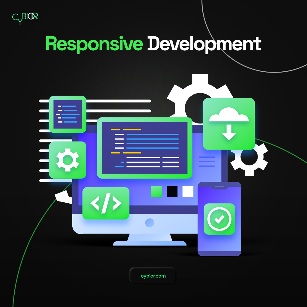
While responsive development may require a larger initial investment, the long-term benefits are clear. A responsive website will provide an optimal viewing experience for users regardless of their device. 

This can lead to increased traffic and engagement and improved search engine rankings. In addition, a responsive website will be easier to maintain, as there is no need to manage multiple versions of the same site. Responsive development is clearly the way for businesses that are serious about attracting and retaining online visitors.

Let’s dig deep into the benefits you will get by investing in responsive development:

  • Increased Traffic
  • Improved Search Engine Rankings  
  • Easy To Maintain
  • Manage Multiple Versions Easily
  • Attracting And Retaining Visitors

Increased Traffic

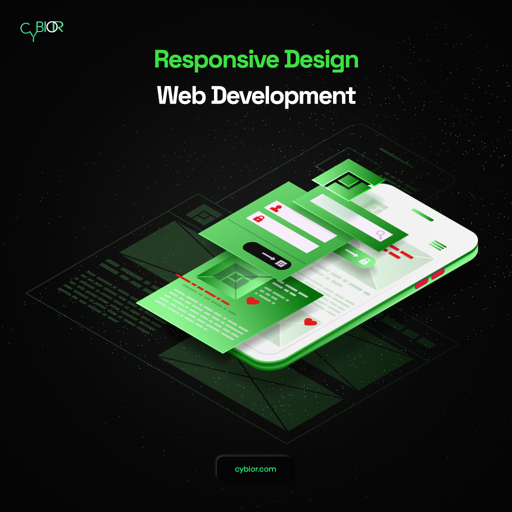
When your website is responsive, it ensures an optimal viewing experience for users on any device. This can lead to increased traffic as users are more likely to visit and stay on a site that works well on their device. In addition, responsive design can also help improve search engine rankings, as Google now uses mobile-friendliness as a ranking factor. 

Improved Search Engine Rankings

Google now uses mobile-friendliness as a ranking factor, which means that responsive websites are more likely to appear higher in search results. Responsive websites provide a better user experience, and Google wants to promote sites that give users what they want. 

Easy To Maintain

A responsive website is much easier to maintain than a non-responsive website, as there is only one version of the site to keep up-to-date. This can save time and effort, particularly for businesses with multiple websites. 

Manage Multiple Versions Easily

If you have multiple versions of your website (e.g. separate mobile and desktop sites), then the responsive design can make it much easier to manage them. This is because all you need to do is ensure that one site’s content is consistent with the other. With responsive design, there is no need to maintain separate code bases or duplicate content. 

Attracting and Retaining Visitors

With a responsive website, you can provide an optimal viewing experience for users, which can help to attract and retain visitors. This is because they like to visit and stay on a site that works well on their device. In addition, a responsive website will be easier to maintain, as there is no need to manage multiple versions of the same site. 

Development

Get In Touch With Cybior For Responsive Development

If you’re looking for a responsive development company to help you create a website that looks and works great on any device, then get in touch with Cybior today. We have a team of experienced developers who are experts in responsive design, and we would be happy to help you create a website that will impress your visitors.